|
UNDERSTANDING COLOR
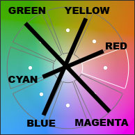
Computer monitors produce millions of colors by
mixing varying levels of red, green, and blue light. These three
are complemented by opposite colors of cyan, magenta, and
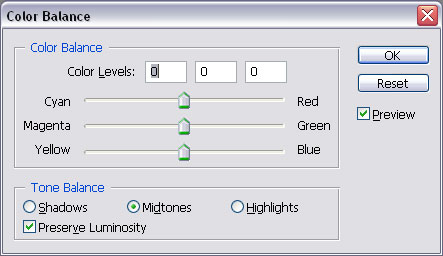
yellow. Color correction software provide controls to
add/subtract colors, including Curves, Levels, and White/Color
Balance. Generally a combination of two colors will need to be
altered. It is better to make several small adjustments if coarse
adjustments don't work well. Always try using automated
corrections before resorting to manual ones. Programs such as
Photoshop allow you to fade the current adjustment. I find that a
combination of Auto Levels and Auto Color, along with fading produces
good results with the least amount of effort.
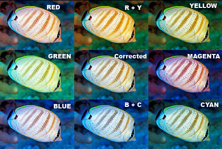
What is interesting about color correction is that
there are two ways to make the same adjustment. For example, an
image with too much green can be easily corrected by subtracting green,
moving the slider toward magenta, but the same effect can be
accomplished by adding equal amounts of red and blue.
Silkypix
RAW conversion software approaches color correction in a different way,
with a primary Blue to Red slider and two Green to Magenta sliders, one
for highlights and the other for shadows. This method takes
practice to master.
|
| COLOR SPACES
Color spaces are data tables created in an effort to reproduce colors
accurately between various devices such as cameras, computers, and
printers. Two common photographic color spaces are sRGB and Adobe
RGB. The sRGB color space has a limited color palette barely
acceptable for posting images to the web, not printing. Serious
photographers should use the Adobe RGB
color space since it has a wider color palette which renders colors more
naturally on screen and print. In order to see the difference one
must be using a high-quality monitor.
|
| MONITORS & CALIBRATION
Inexpensive monitors are designed for web browsing, games, and office
work using the sRGB color palette
which reproduces much less than what the eye can distinguish. High quality
photo editing monitors designed to reproduce the Adobe RGB palette cost
several times more but are worth the investment if you are serious about
photography. Regardless of the make/model a monitor should be
calibrated before editing.
Monitor calibration is extremely important for digital
photographers. Unless your monitor is calibrated the colors on
your camera, computer, and prints will not match. Color
corrections and adjustments using software will not be accurate or easy.
A variety of calibration devices are available, some for less than
$100. I use a ColorVision Spyder and the difference is
immediately apparent when I look at images corrected before and
after.
|
| SOFTWARE
Quality digital cameras are usually quite good at producing acceptable
colors, however underwater performance can be hit or miss depending upon
a few factors. Regardless of the cause, a fair number of images
can be corrected with imaging manipulation software regardless of
brand. Best results are obtained from high-end programs including
Photoshop and Paint Shop Pro but simple
'one-click' solutions from Picasa and those bundled with your camera may produce remarkable results.
These corrections will work with any digital image format but the
best results can only be realized by users whose cameras offer RAW image capture.
|
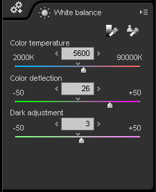
| WHITE BALANCE Some
cameras have an 'Underwater' scene mode that adds orange to the image to
offset blue light. This is akin to placing an orange filter on a
film or video camera minus exposure adjustment caused by the filter
itself. Despite this option the best practice is to set the
camera's white balance to 'Daylight' or 'Auto WB' if it produces
satisfactory results.
Of course you could take photos at depth using available light
employing a 'Custom' white balance (see your camera manual) but my
experience with this method is that it is best reserved for wide angle/available
light scenes. Custom white balance must also be reset with major
depth changes or alternating sun/clouds. Closeup work requires the
additional depth of field & sharpness possible with flash.
Custom white balance should not be used underwater along with flash.
|
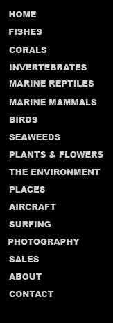
Available light using Custom white balance
|
Note unsharpness due to subject movement & lack of flash
|
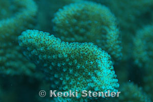
Auto white balance plus flash
|
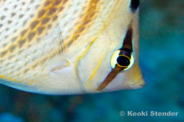
Improved sharpness provided by flash
|
|
SATURATION Sometimes color correction alone can appear
artificial, especially when the image is richly colored or
over-saturated.
Most Point & Shoot cameras lean toward over-saturation.
The intensity of color can often be reduced to restore a more natural
look. Signs of over-saturation are most noticeable in the image's
highlights and shadows. If your software has the option of
adjusting saturation by individual color you can simply de-saturate that
channel. Another method is to use the Levels or Histogram tool to
adjust the unwanted color's highlights and shadows.
|
|
INCREMENTAL ADJUSTMENTS
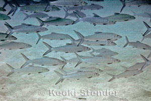
The most common color issue is caused by cyan/blue
ambient light from filtered sunlight. Adding red and/or yellow
(orange) can help things look more true-to-life. I suggest making
several incremental changes rather than a big one. The best way to
recognize how much incremental adjustment is 'enough' is to keep the
image highlights from assuming the colors you are 'adding'; i.e. keep
the whites white. By making several small adjustments you should
be able to obtain a more pleasing and natural-looking product while
adding more orange overall.
|